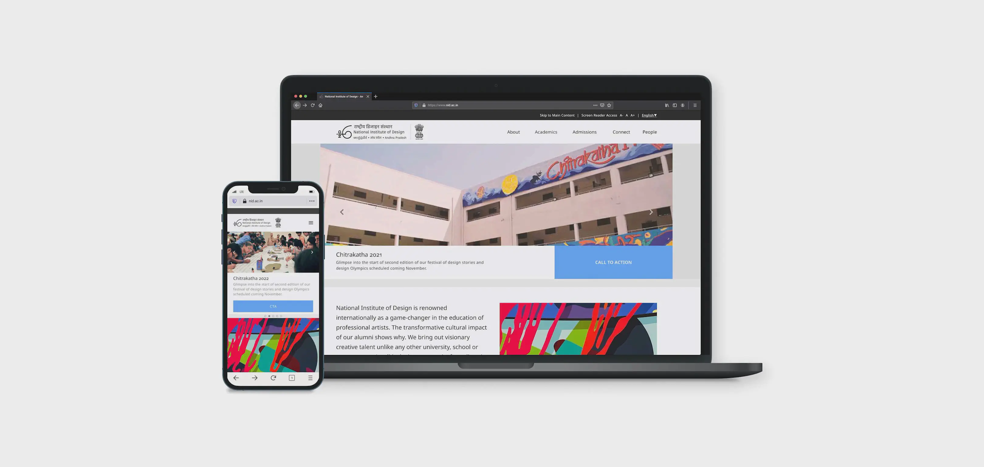
NID AP Website Redesign
UI/UX Design
A bit of context
National Institute of Design Andhra Pradesh (NIDAP) is one of the largest design colleges in India and happens to be my Alma-mater. At the time of the project, the college offered a four year undergraduate degree program.
In 2021, the NIDAP website was to be ported to NIC-hosted servers and as a part of the expansion, was redesigned for expansion and more features. For the same, the task at hand was to identify the key users and propose a design better suited for scaling.
Timeline
Over the period of 5 weeks, the target was to deliver the information architecture, the visual designs, and high-fidelity mock-ups of the site.

Being the only designer initially working on the project I stuck to mobile and desktop screen layouts to meet the deadline. I was working with Prof. Sekhar Mukherjee (Director, NIDAP) and Dr. Amaltas Khan (Faculty member, Industrial Design). Later on, I was assisted by Midhun Krishnakumar, Aditya Karra and Deeptanshu Sanyal - some of my seniors who had worked on the first website. I also worked with project leads, managers, and developers from the company tasked to develop the site.
Goals
- Understanding the goals and requirements of the institute regarding the website.
- Plotting said requirements and goals alongside user studies to understand priority and order.
- Design the information architecture from the inferences.
- Design the visual language based on the qualities of the institute and the functional requirements of the site.
- Work on low and high-fidelity mock-ups to hand-over the project to the developer.
The challenges of the existing platform
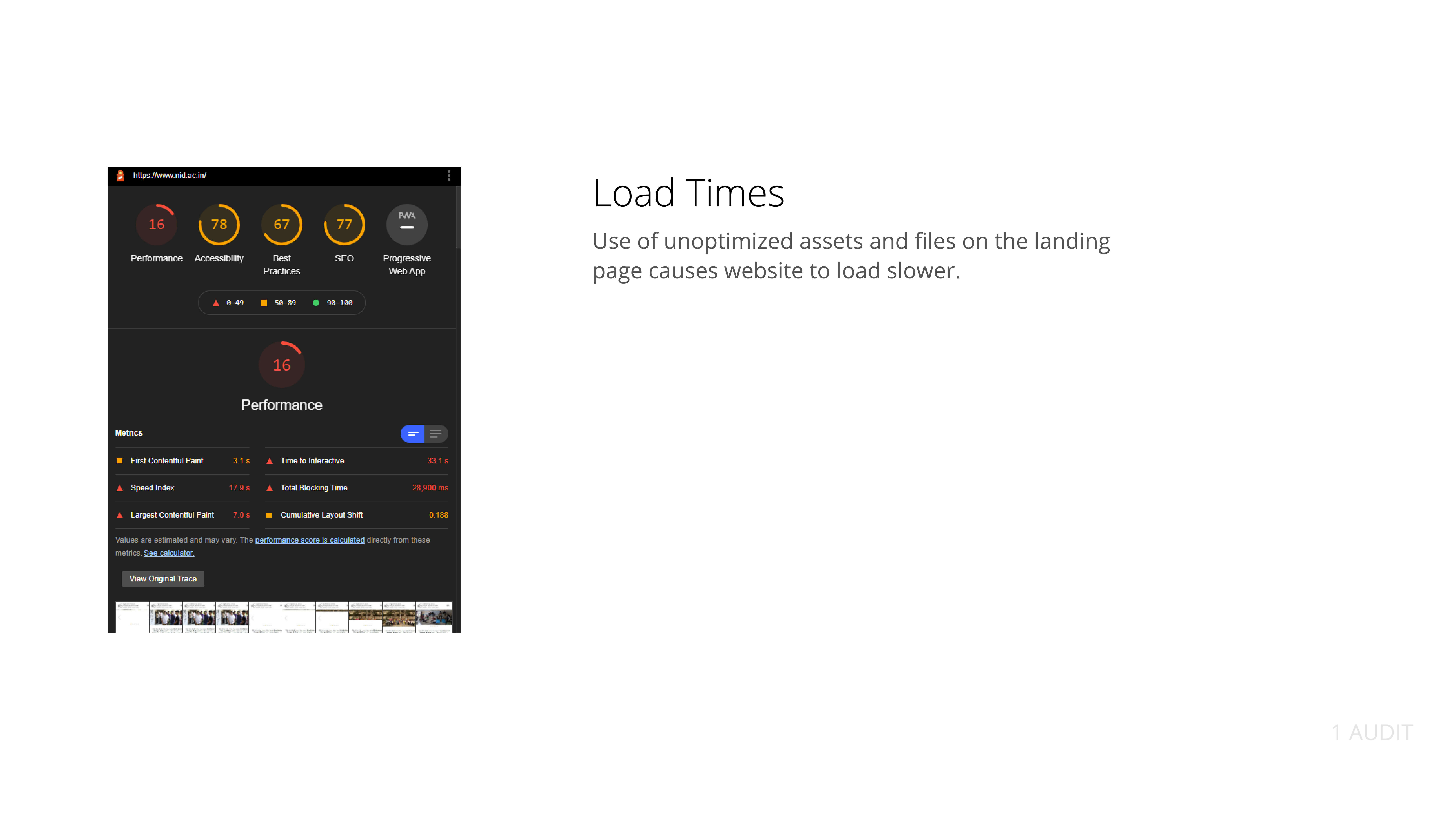
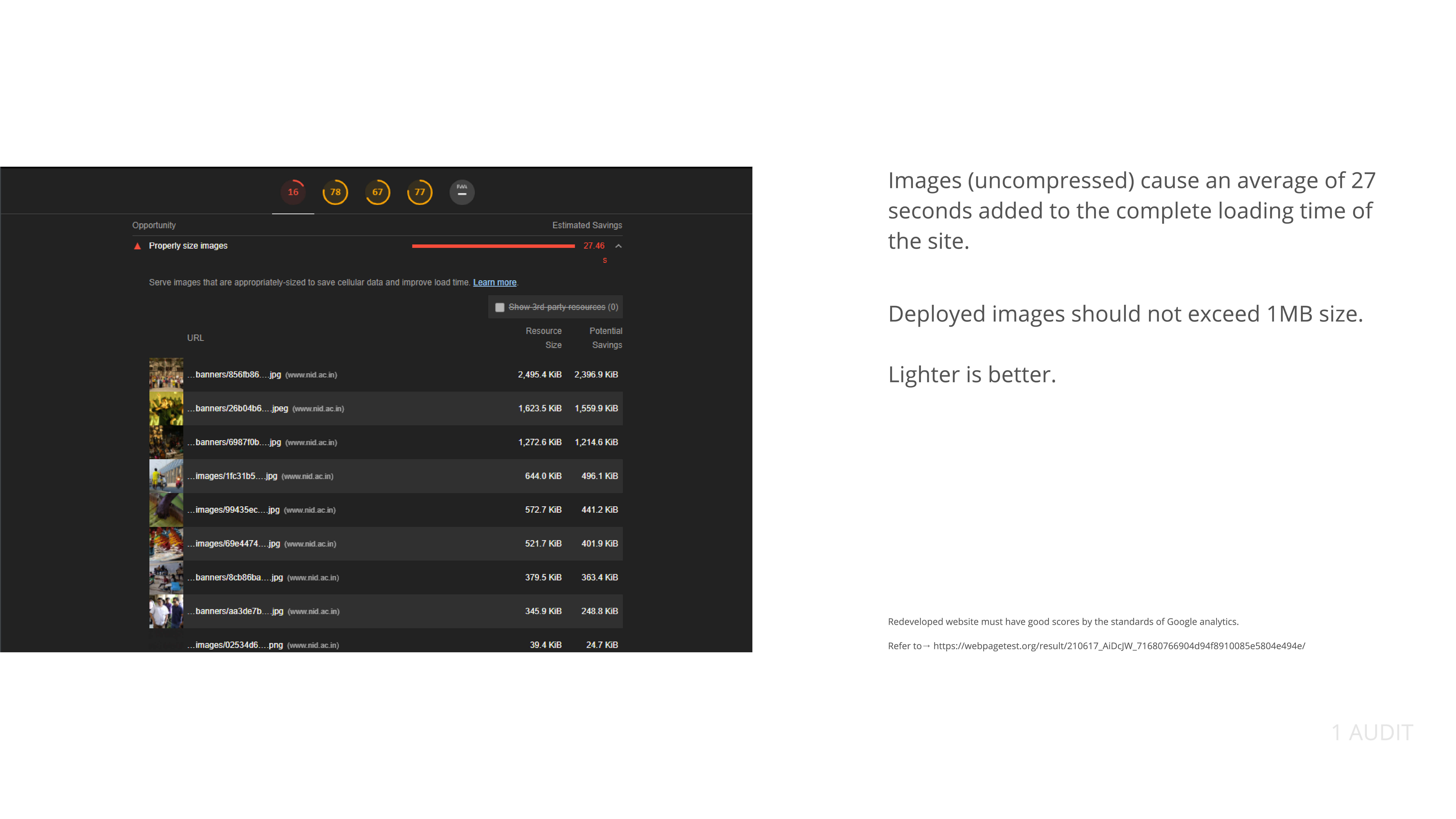
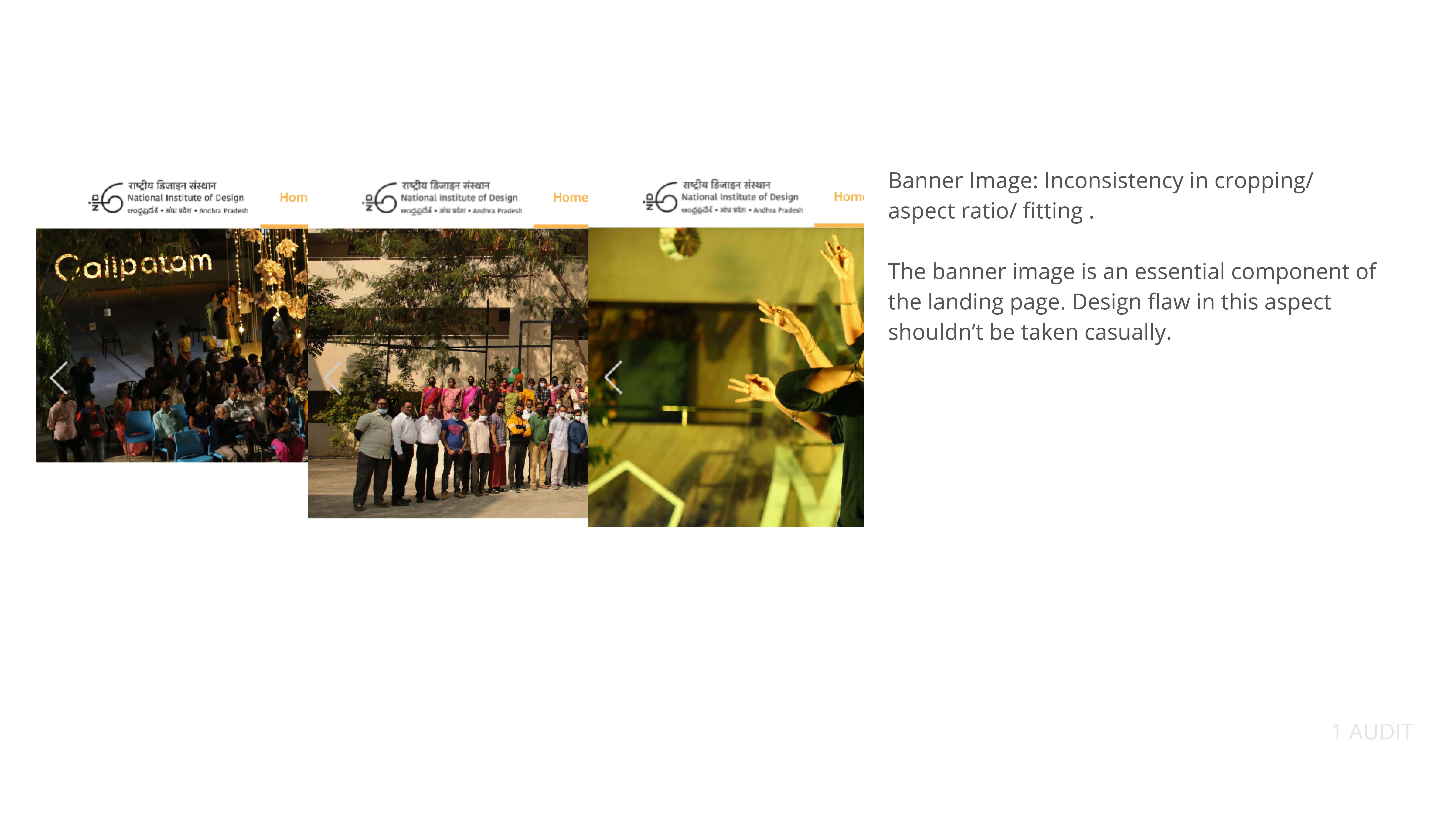
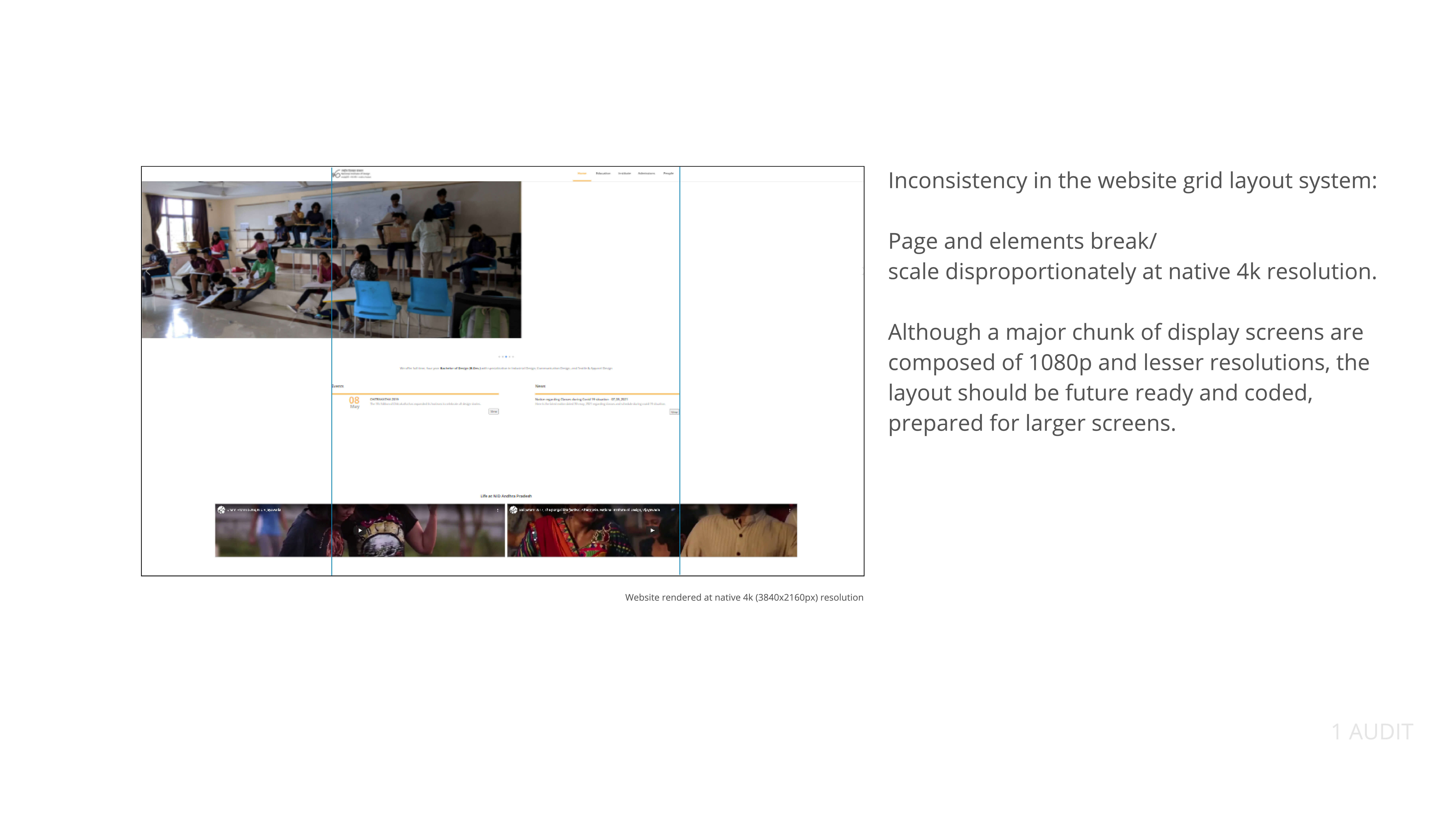
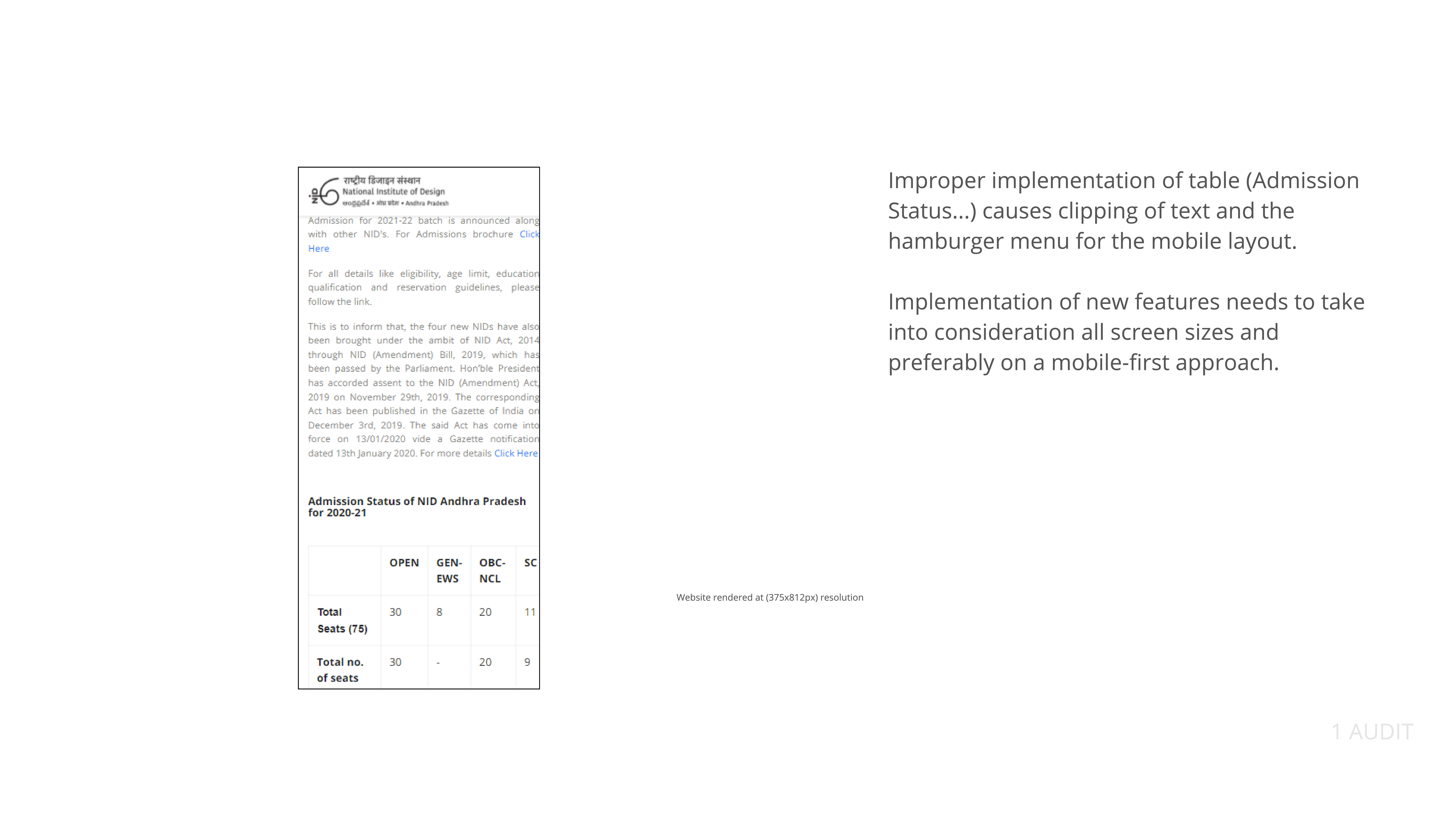
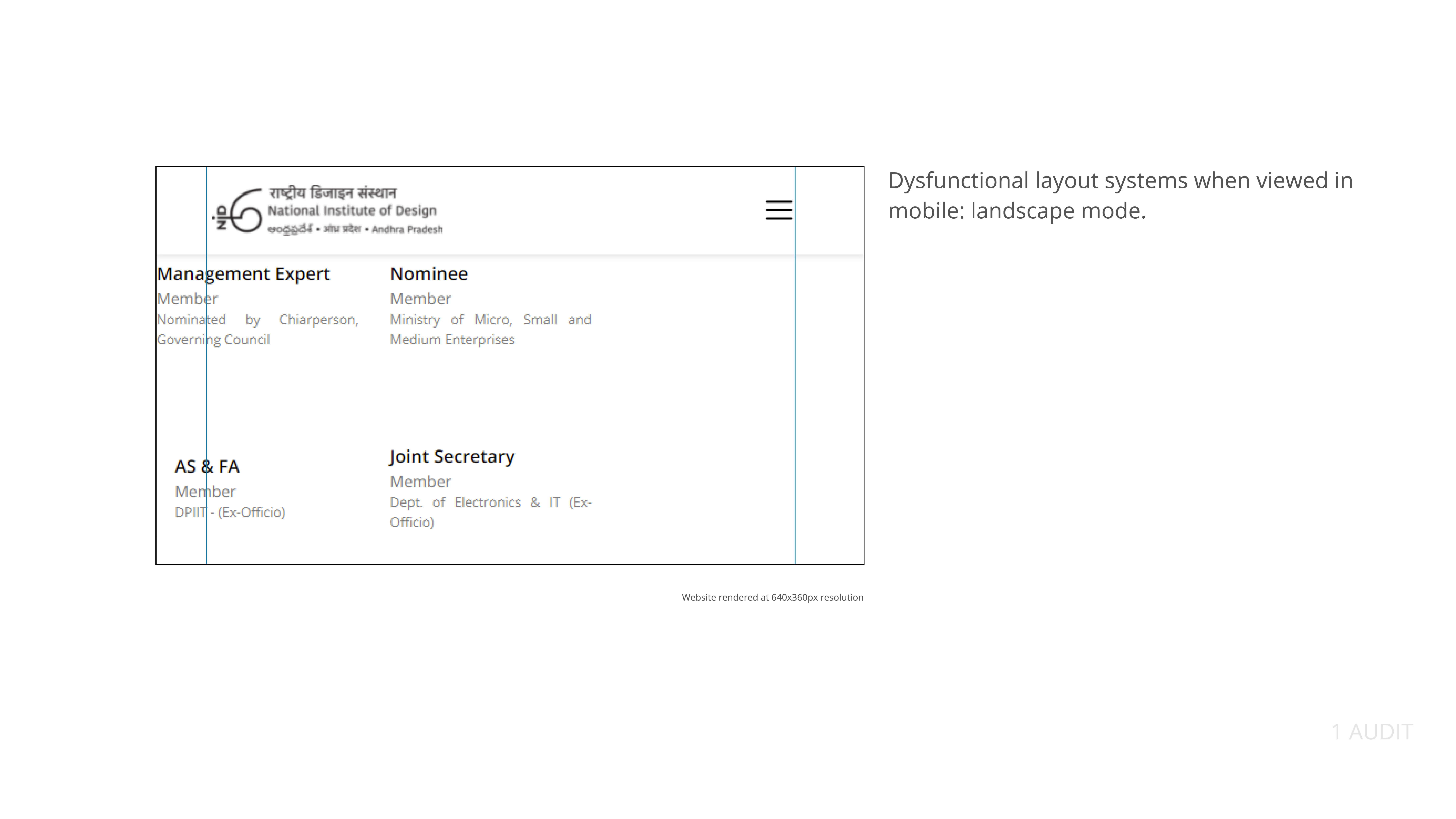
The existing website as observed at the time was designed sometime in 2017 by the students and implemented by a third-party website managing service. The website was well designed, planned, and served all of the purposes at the time however over the years, suffered from a lack of maintenance. A quick audit of the front-end of the site showed these issues:
Many of these problems were development-related and I categorized them as such during the audit.
Deep-diving and identifying pain points in the current website
The first step of the process was to figure out the primary & secondary stakeholders of the project and their use-cases. Figuring out their needs/ wants helped order and group sections of the site for more intuitive navigation.
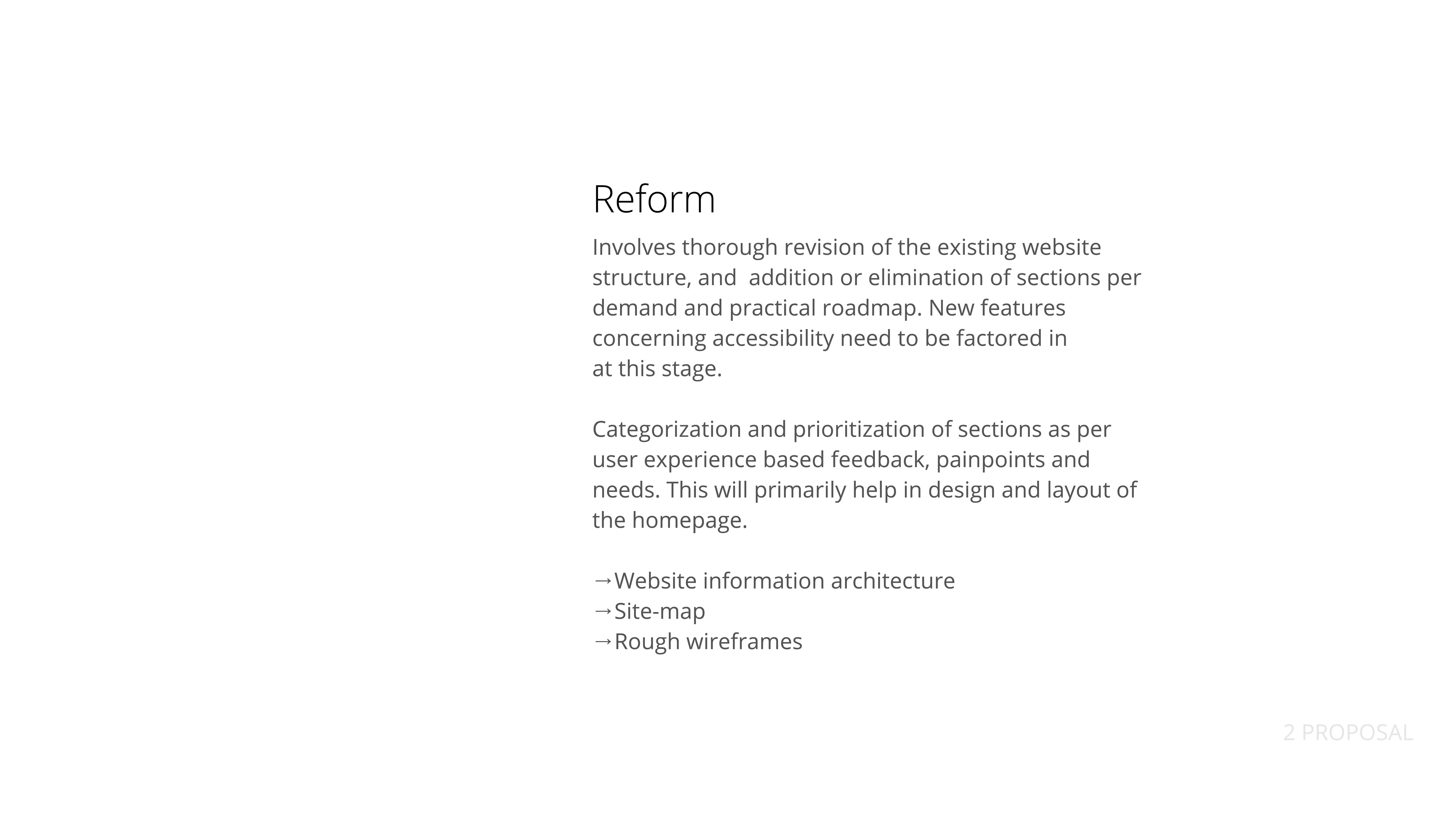
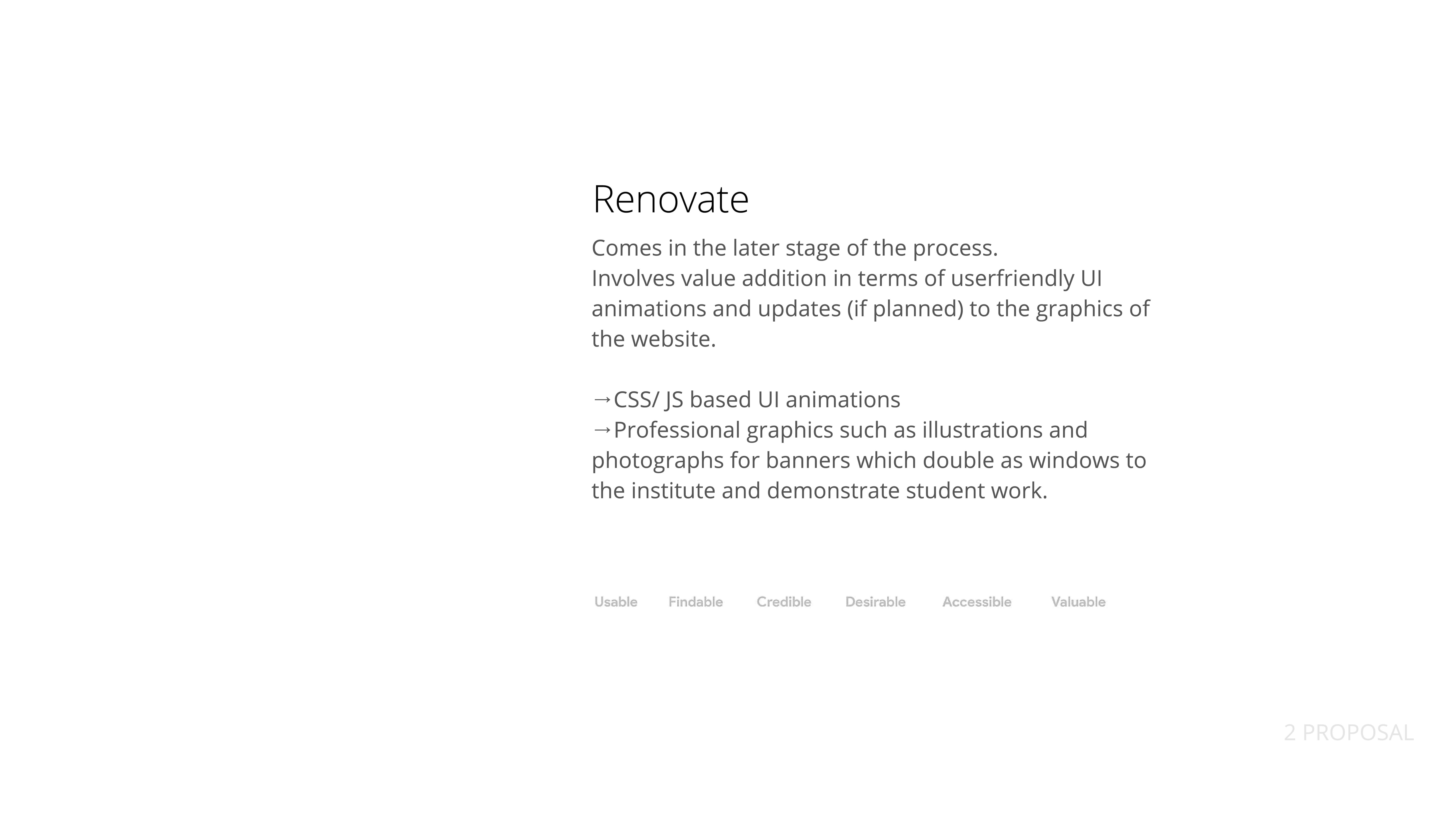
Because of limitations on time and the absence of a team, I avoided reinventing the wheel. Instead, I looked back at the existing philosophies undertaken by Anisha Bhatt, Aditya Karra, Midhun Krishnakumar while designing the existing site; building on it to accommodate the current future requirements.
Because of limitations on time and the absence of a team, I avoided reinventing the wheel. Instead, I looked back at the existing philosophies undertaken by Anisha Bhatt, Aditya Karra, Midhun Krishnakumar while designing the existing site; building on it to accommodate the current future requirements.
Stakeholder Mapping
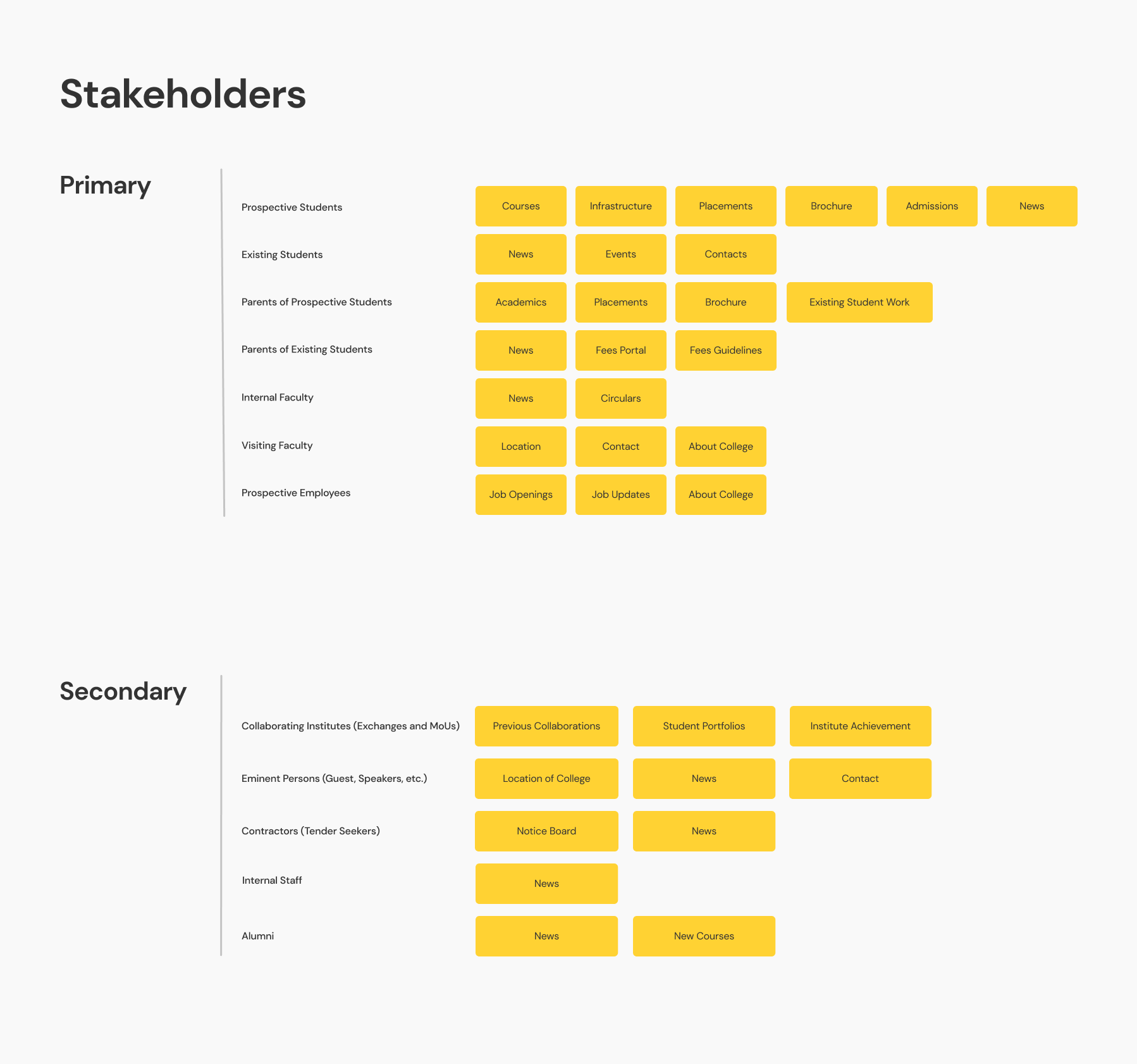
Listing out major users/ stakeholders
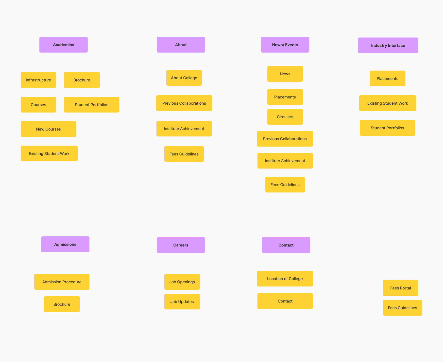
Bucketing/ Sorting User Goals under larger categories
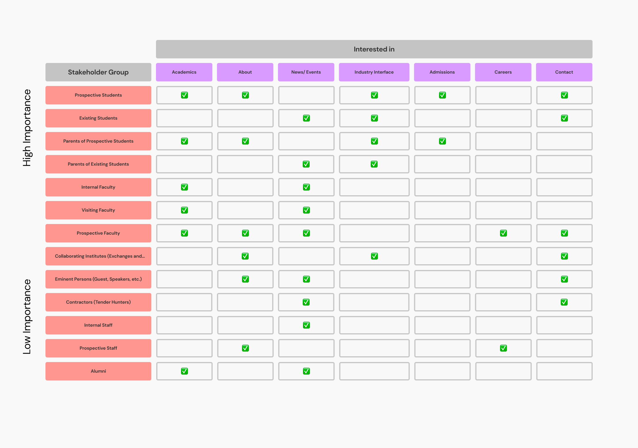
Stakeholder Matrix
Restructuring information and a new site map
I developed a new site map with the following considerations:
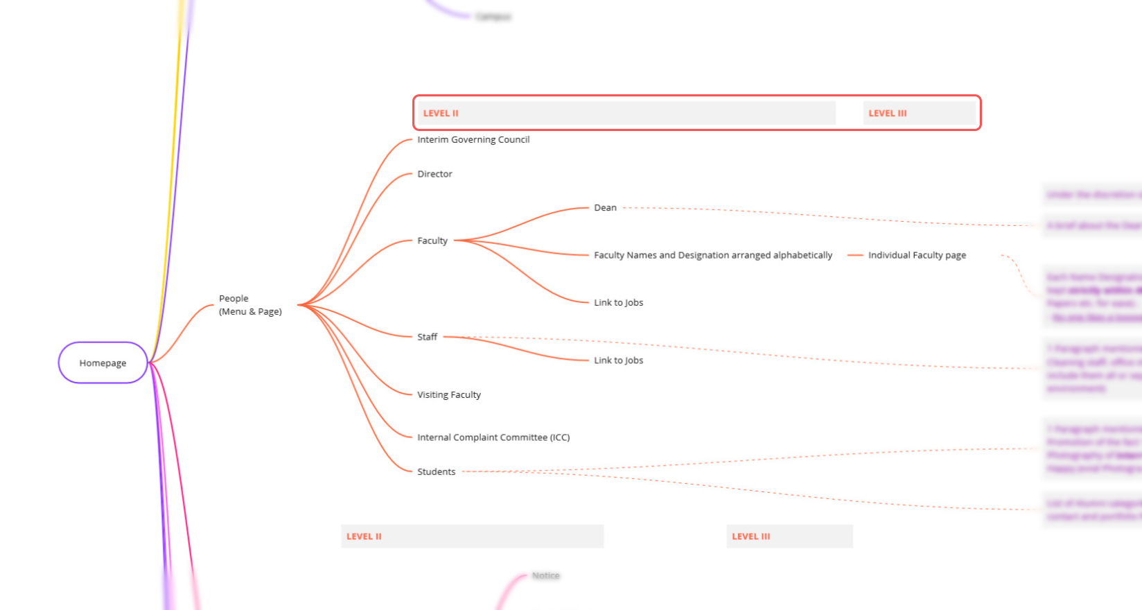
1. Compartmentalization of the various types of information that NIDAP wishes to present, arranging it in three levels/tiers. This system accomodates the future expansion plans of the college and the subsequent sections that are to be added for the same reason.

2. Inter-accessibility of contextually relevant sections. (Admissions from Courses and Curriculum/ Jobs and Career from Faculty and Staff pages)

3. Use one unified blog-like portal for all news and events. Using filters like tags to sort/ categorize items.
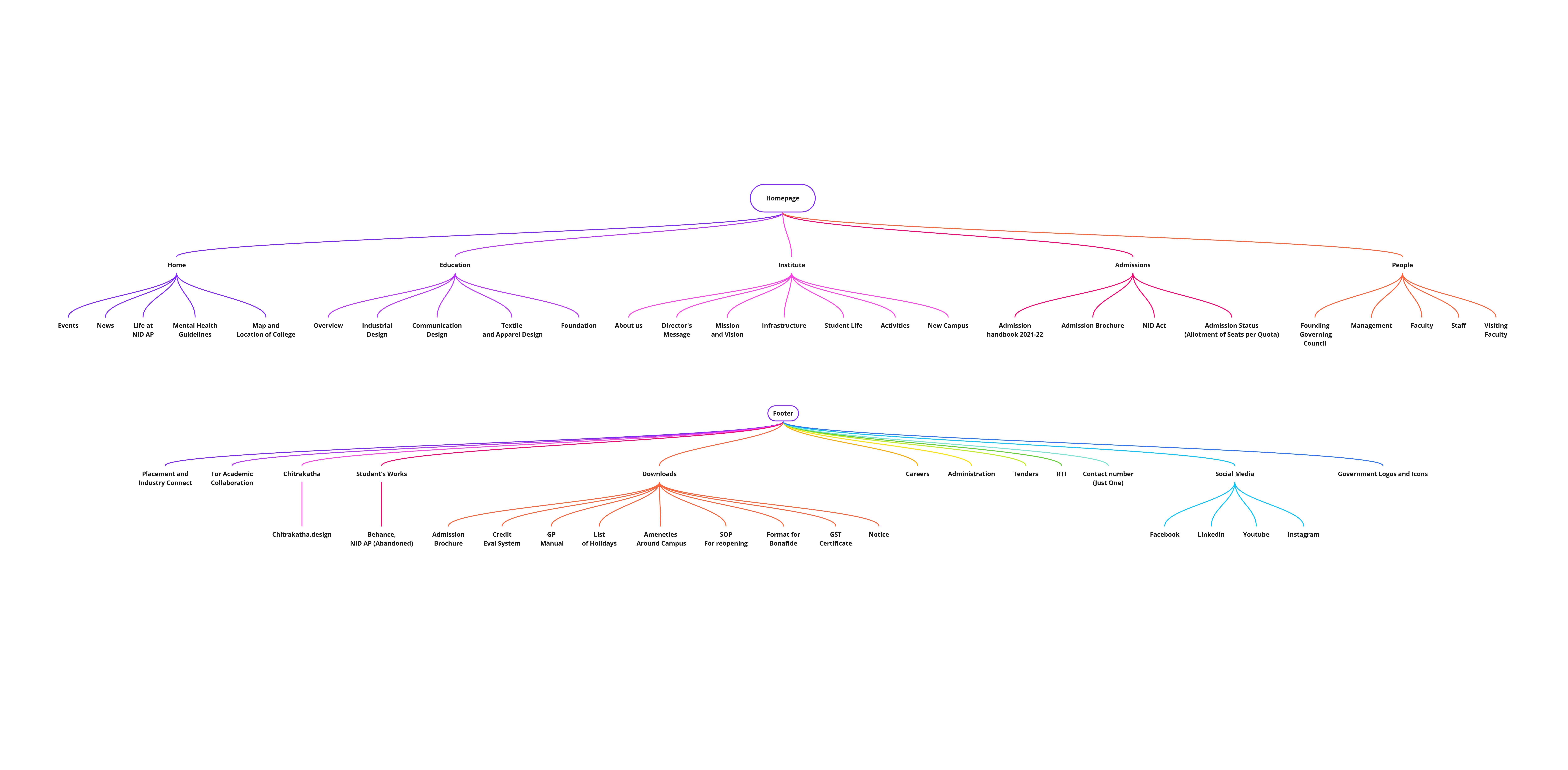
Old Sitemap
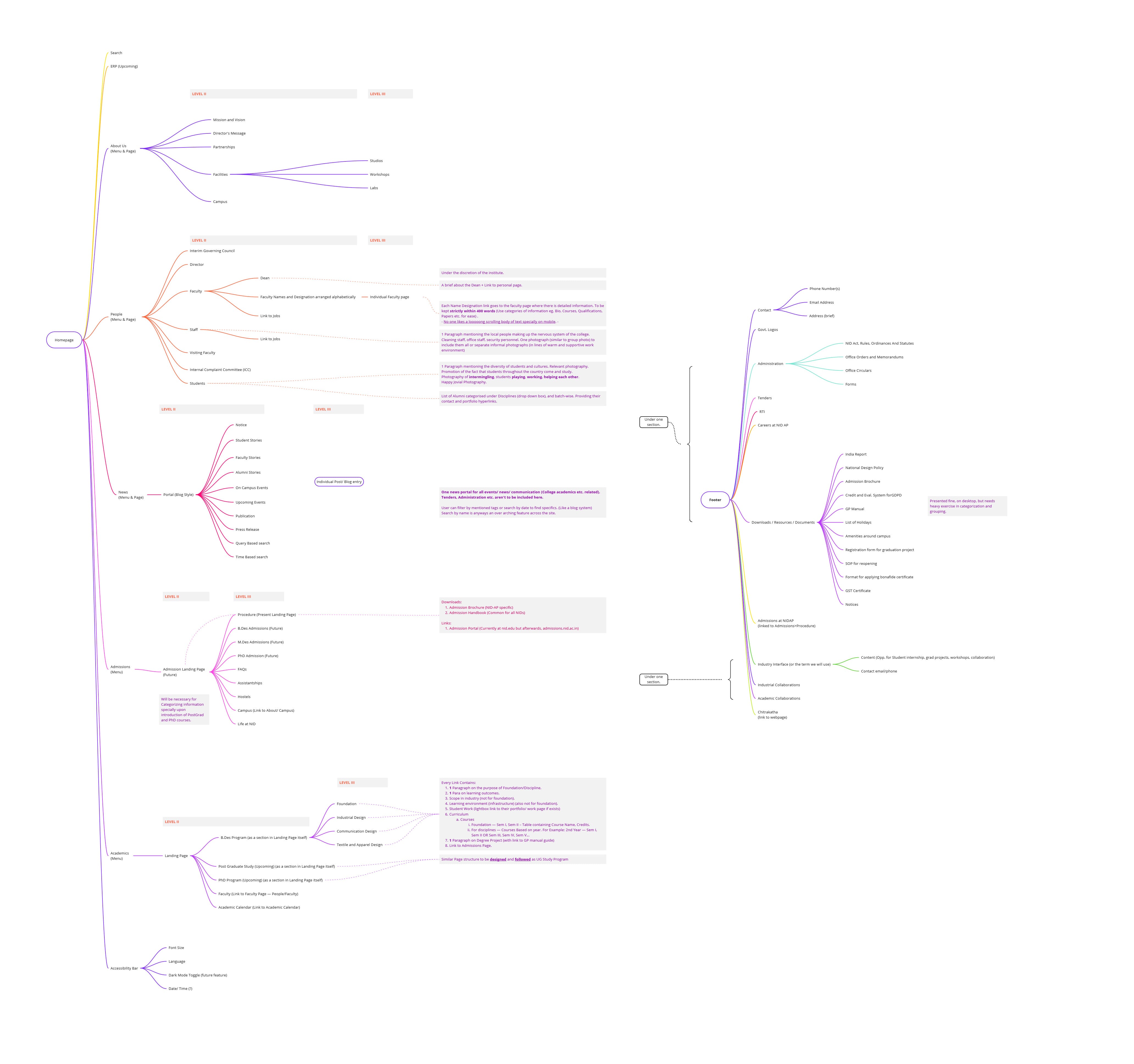
New Sitemap with pointers on copywriting
Visual Design
- Based on limited user reviews, it was understood that the visual language of the existing website had a good reception and worked well as intended.
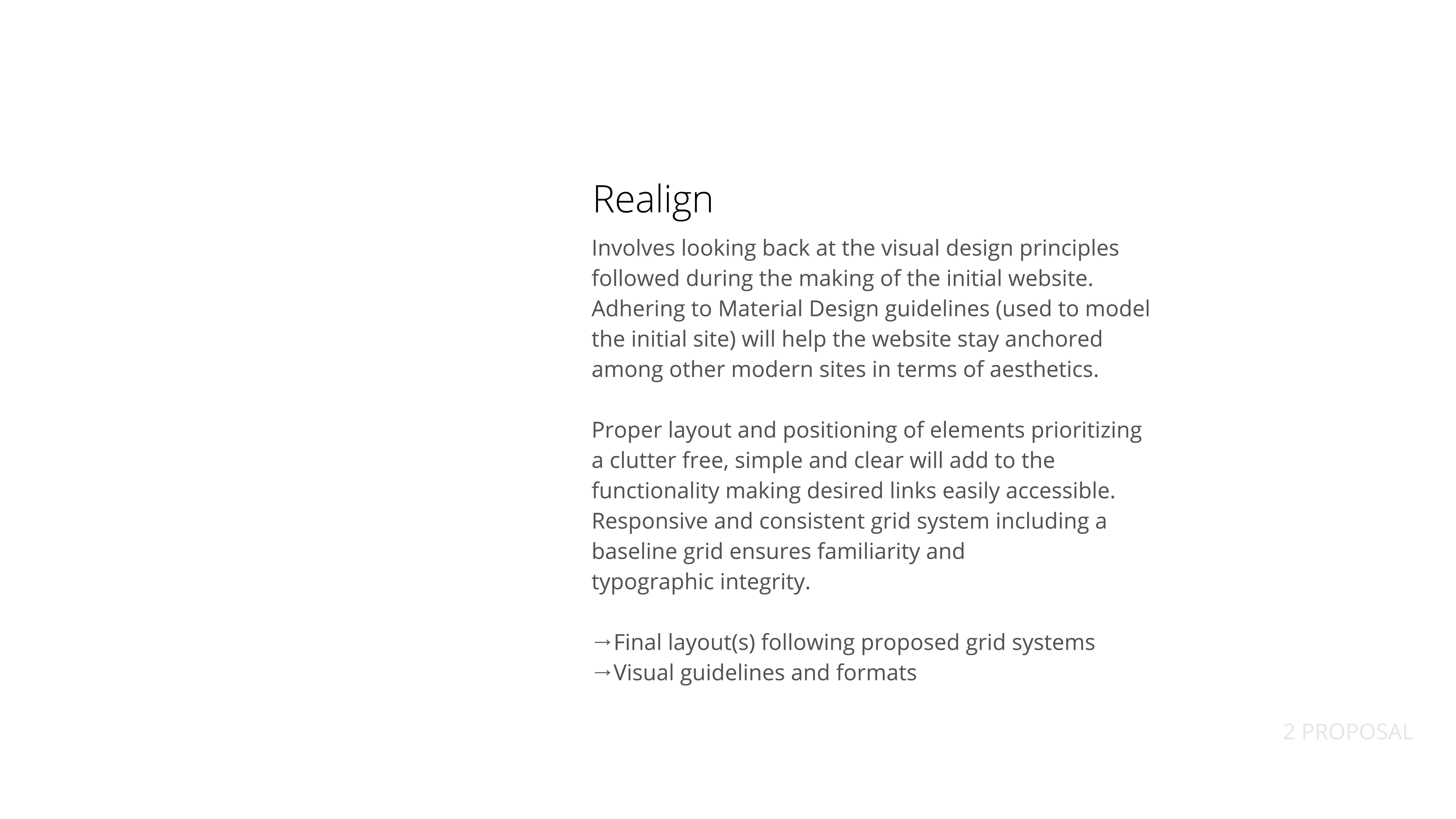
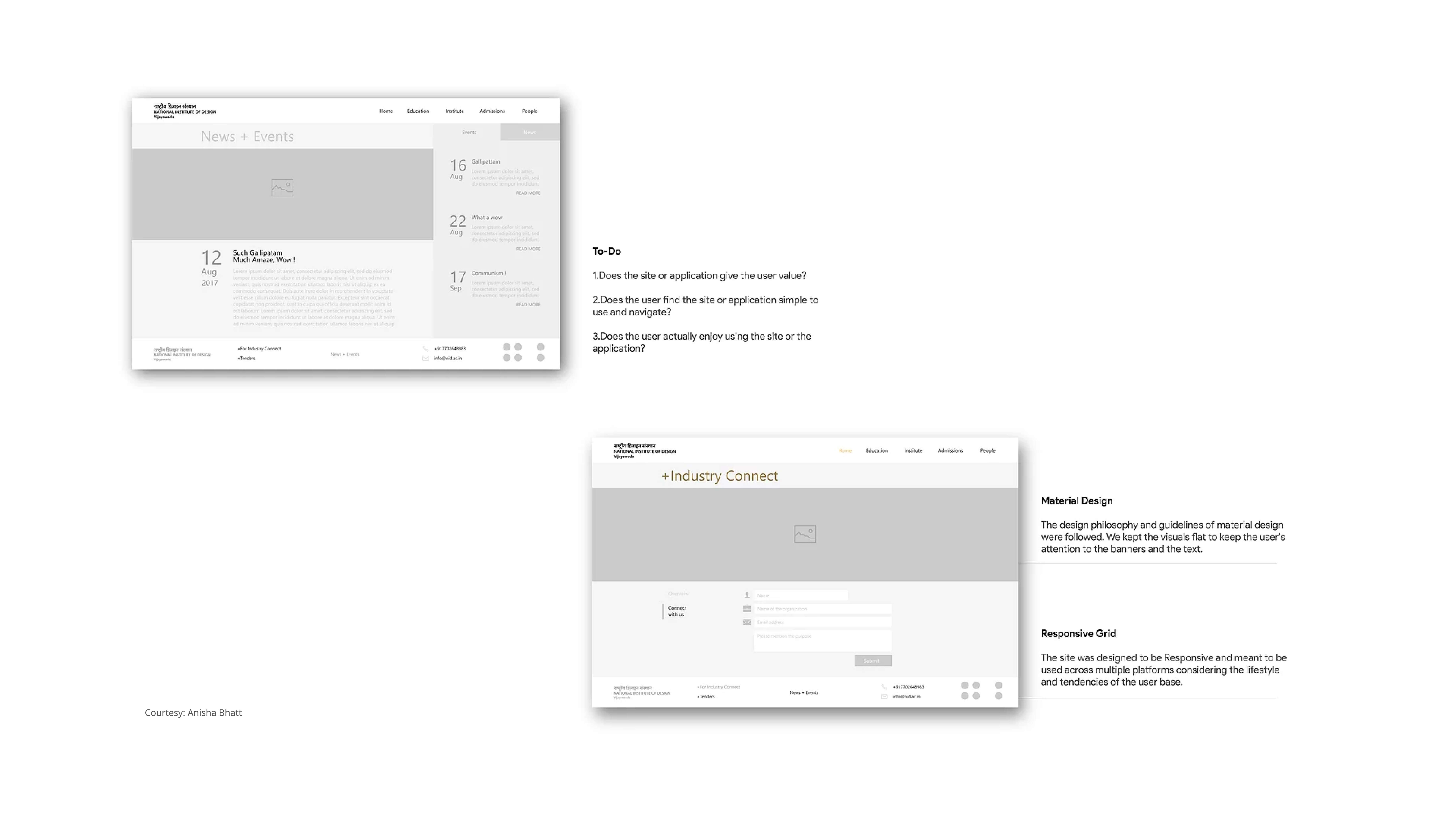
- I retained much of the original philosophy working with the Google Material Design Guidelines.
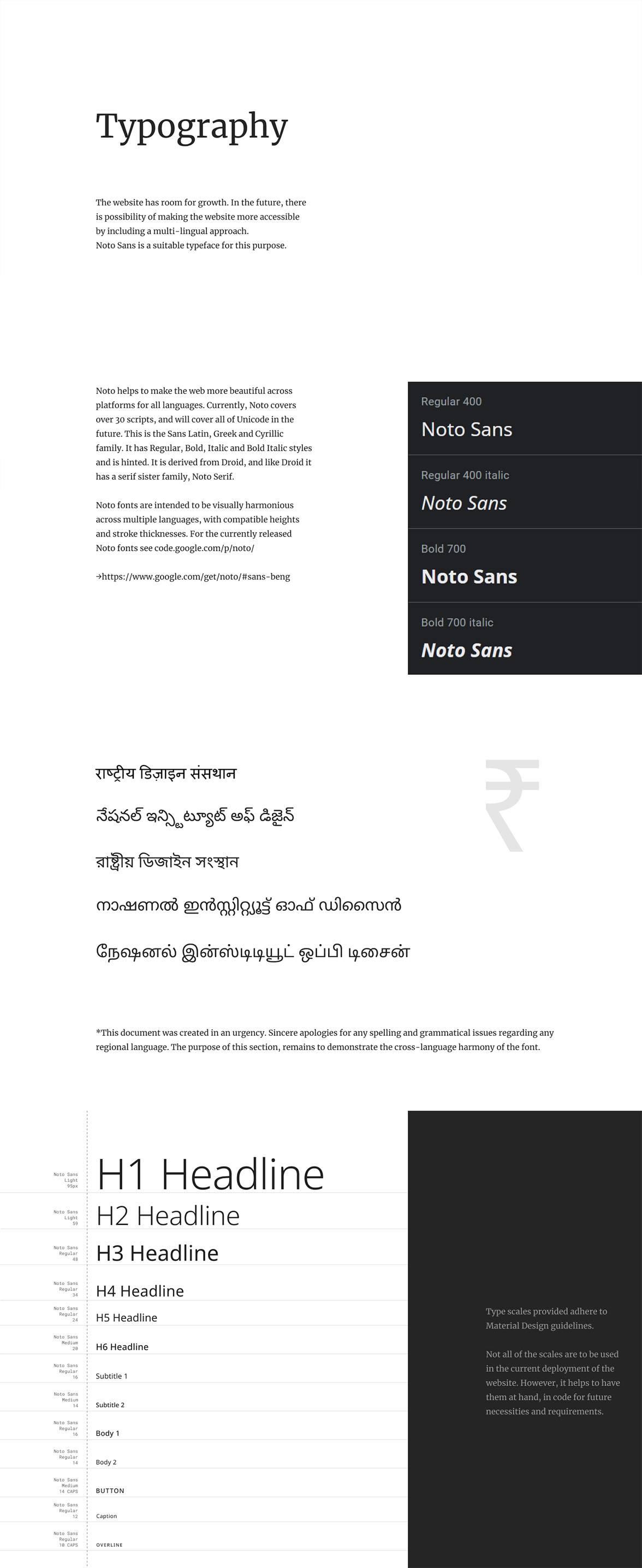
- The institute wanted the site to be working in regional languages (Hindi, Telugu, etc.). To accommodate this, I used Noto Sans by Google and icons largely from the material icon library to keep things simple and consistent.
- The color-based grouping philosophy was also retained and I selected colors from the material design palette, focusing on legibility and hierarchy. I selected the colors to work in light mode only.

Colour System

Typescale
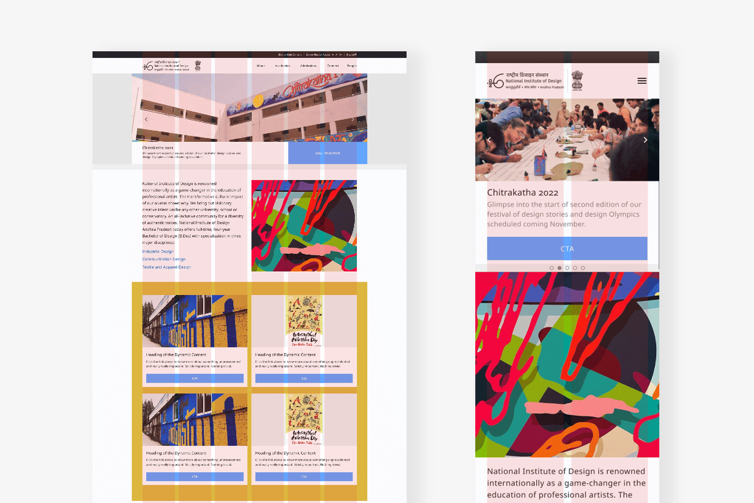
Grid System
Wire-framing
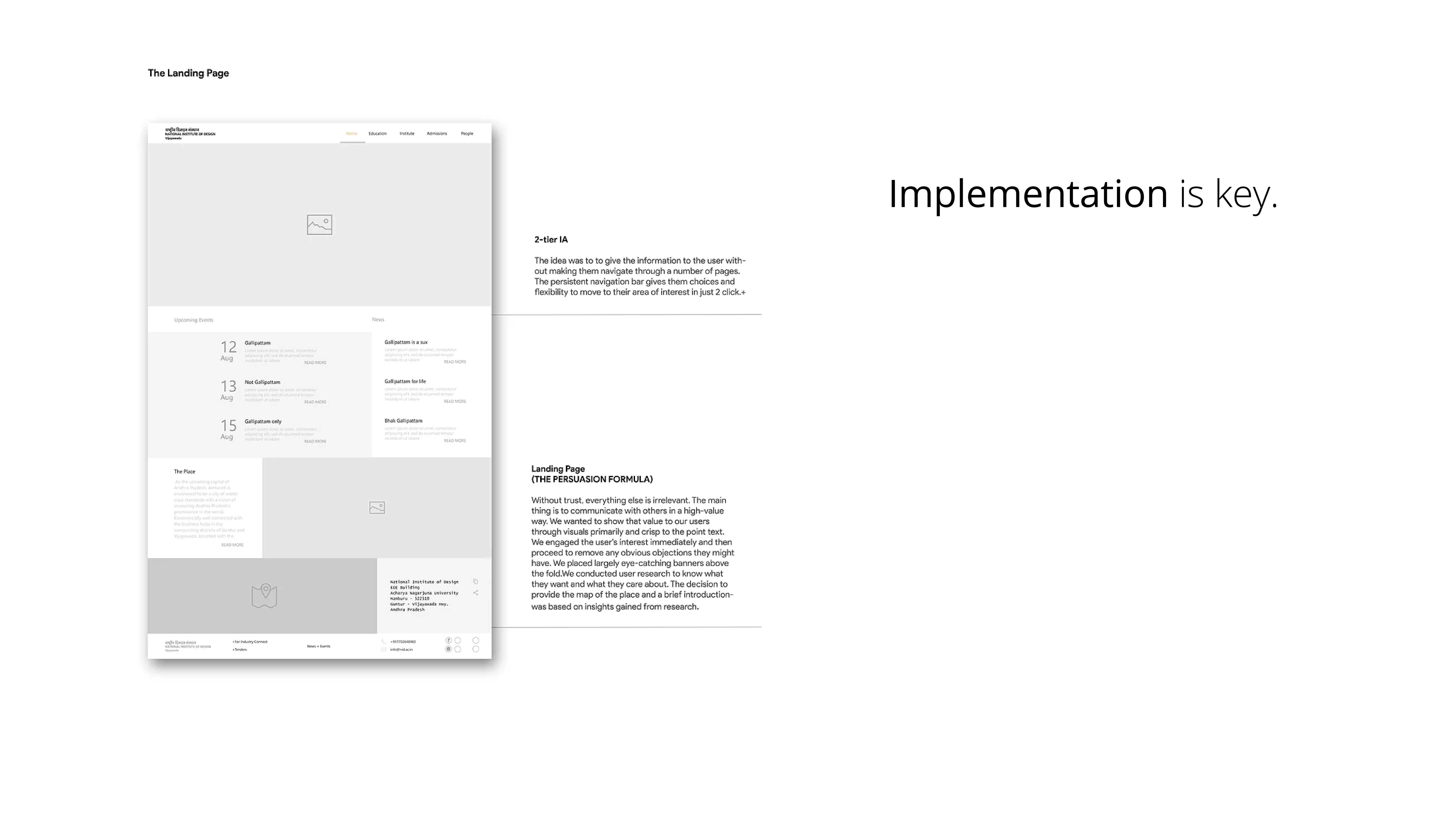
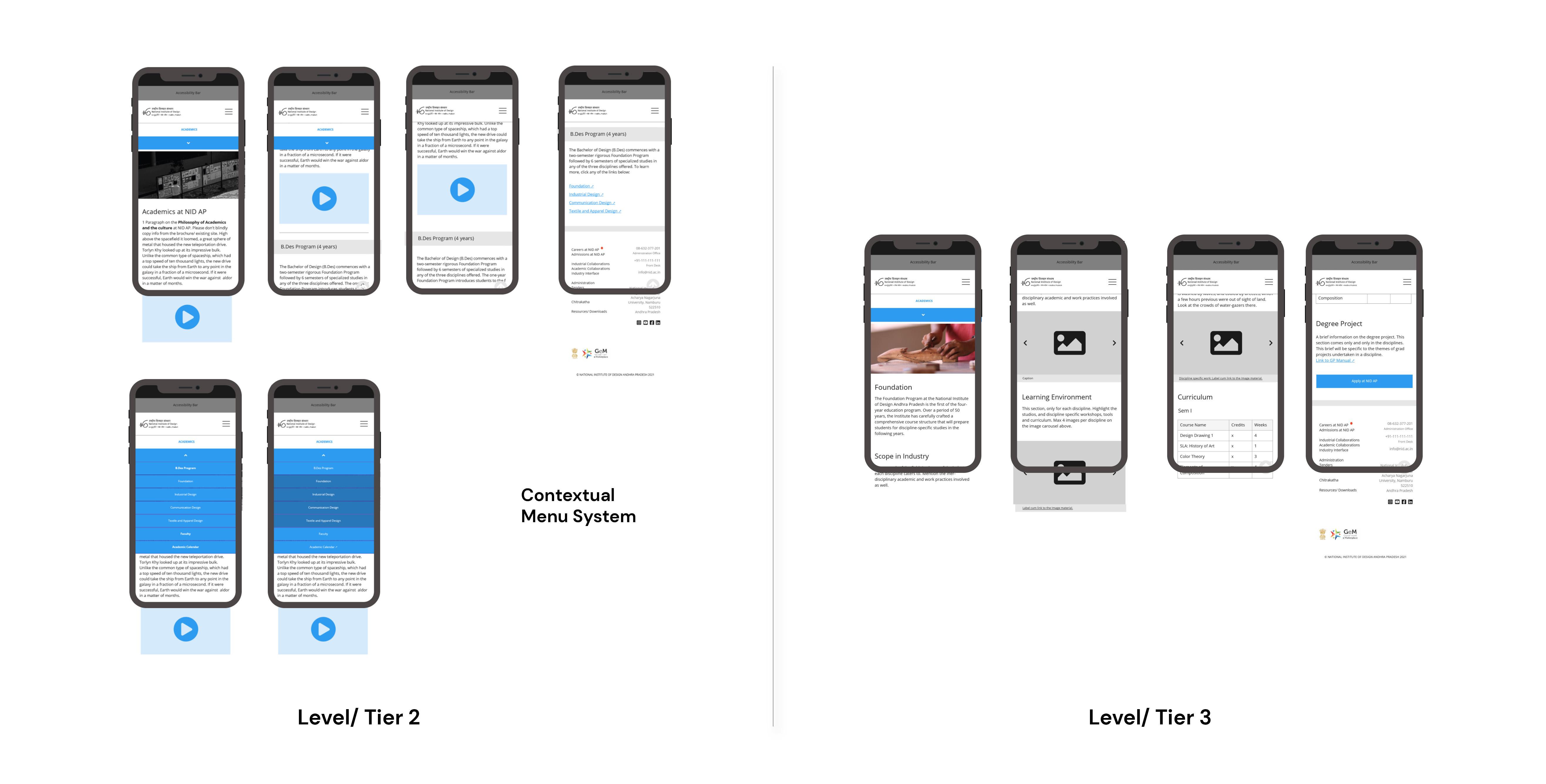
I began wire-framing with the mobile-first approach, using Miro for rough prototyping quickly transitioning to Figma for a high fidelity prototype. In my low fidelity prototype, I designed the broadly fundamental chunks —
- Homepage, Level I, II, and III pages.
- I retained much of the original philosophy working with the Google Material Design Guidelines.
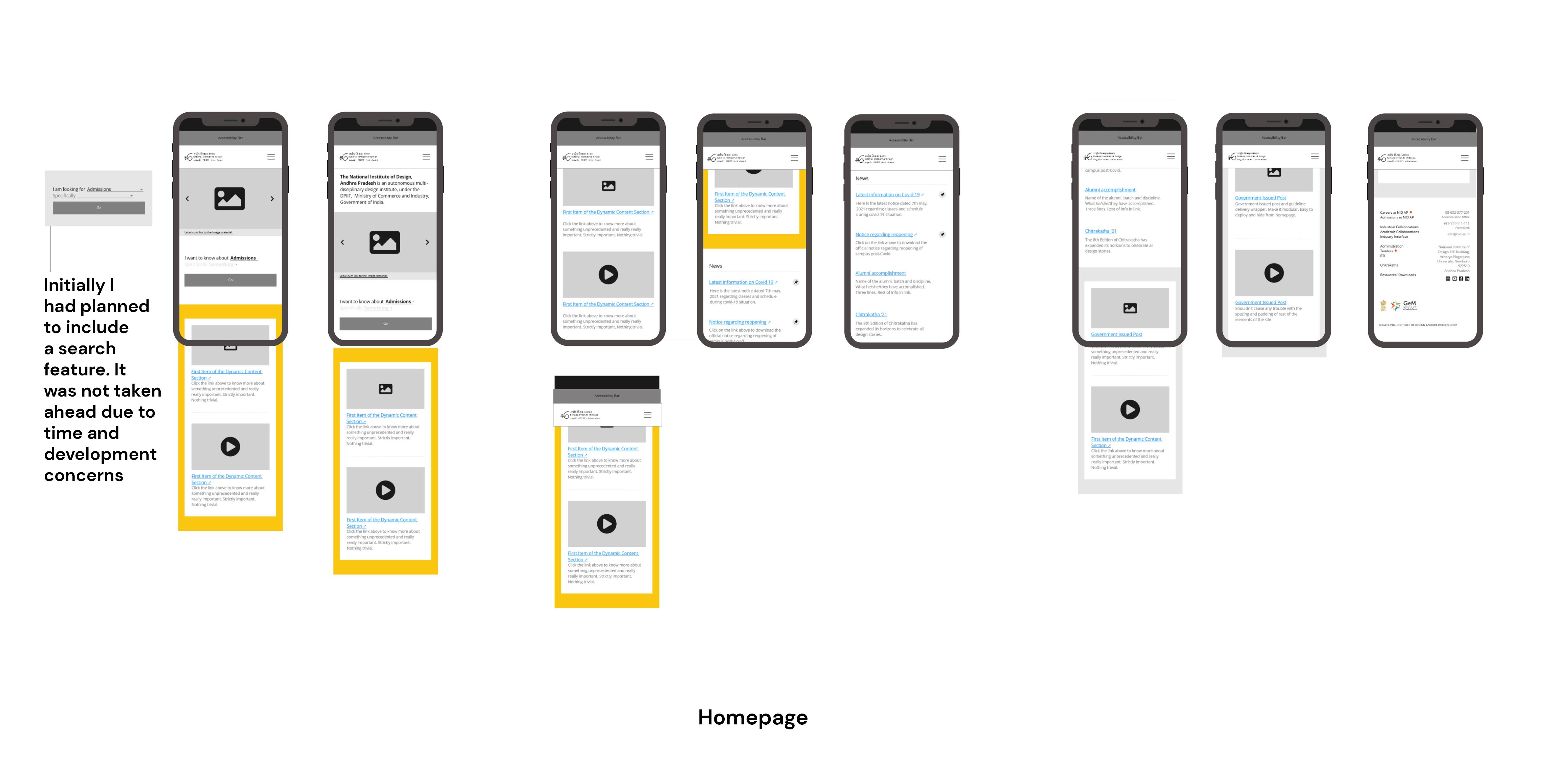
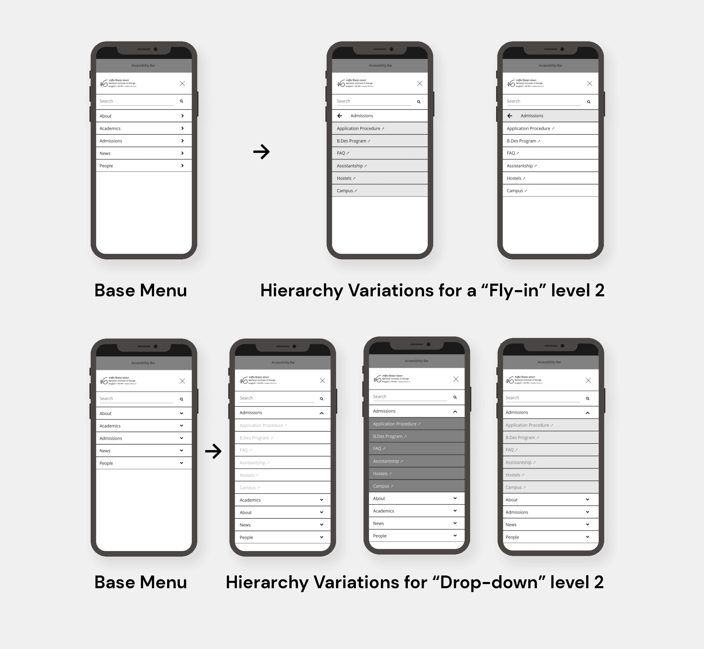
Main Menu Low fidelity prototype
Key Workflows
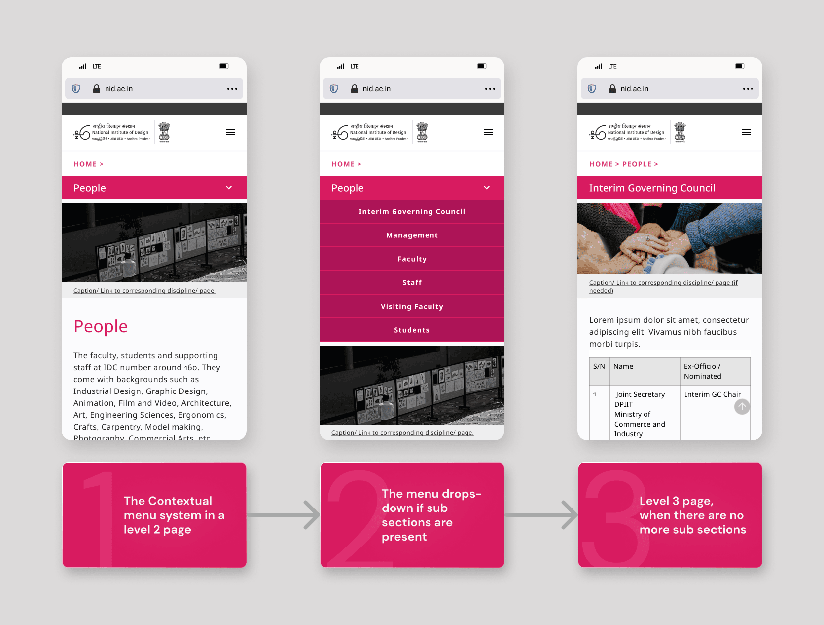
- The contextual menu system
The contextual menu system helps users navigate Level II and Level III pages. The menu color and contents change depending on the section of the site. (Thanks to Aditya Karra for his help in this section)
The breadcrumbs model on top:- Helps the user know where they currently are.
- Easily navigate one or two steps back from where they are.
- I proposed to remove the “Home” option in the main menu since the institute logo served its function.
- The old website had two sections for events and news. I proposed to use one single portal to serve both purposes.
Learning & Reflections
- The presence of actual site analytics data from the previous website would have been helpful.
- The news & events portal, because of developmental concerns was most likely not implemented. After I disengaged from the project, the team replaced it with the “Connect” section for industry interface with news and events delivered in the homepage.
- The constant process of review and feedback and working with other designers helped get fresh opinions during various stages of the process. This made iterating and testing out variations easy.
- Learning to use the auto-layout function of Figma helped maintain visual harmony in terms of layout and spacing.
- In hindsight, we could have made much of the prototyping phase easier with more extensive usage of Figma component systems.
- Working directly in code and more collaborative work with the development team could have eased the back and forth during the typesetting phase.
Acknowledgements
Sekhar Mukherjee
Amaltas Khan
Archana
Aditya Karra
Midhun Krishnakumar
Anisha Bhatt
Amaltas Khan
Archana
Aditya Karra
Midhun Krishnakumar
Anisha Bhatt
Peace
View Project
View Project

